
App UI/UX
Mobile interfaces designed for thumbs, battery and impatience.
UI/UX for iOS and Android products: flows, type, motion and empty states that hold up in a queue.
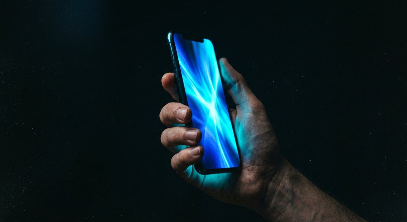
Desktop mockups lying on their side are not mobile design. We compose for one-handed reach, interrupted sessions, and the moment the user has a better app one tap away.
The cinematic standard still applies — just smaller, stricter, kinder.
Benefits
What this changes in the business.
01
Fewer screens that exist only in Figma
Every frame has a reason to be built. The rest is cut.
02
Platform literacy
Tab bars, gestures, settings — we speak iOS and Android instead of inventing a third OS.
03
Copy as a design material
Buttons are verbs. Errors are instructions. We write them, not lorem.
Process
How the work moves.
01
Map interruptions
Call comes in, payment fails, photo permission denied. Those screens are the product.
02
Design the kit, then the flows
Type, colour, components. Then the journeys that consume them.
03
Prototype on glass
Stakeholders hold it. Comments change when fingers are involved.
04
Annotate for engineering
Spacing, states, analytics hooks. The file is a contract.
Technology
Tools we actually ship with.
- Figma
- Prototyping
- iOS HIG
- Material 3
- Motion specs
Questions
Straight answers.
Shared principles, separate where the platforms disagree. One mush file is how you get a UI that belongs nowhere.
Places
Where this work sits.
Industries
Sectors that often need this.
Journal
Notes on the same craft.
Start a project
If the flows only make sense with a narrator, the interface is not finished.
Tell us what you are building. We will reply with a clear next step — usually on WhatsApp.