
Store design
Ecommerce design that sells without shouting.
Art direction for collections, product pages and carts — cinematic, commercial, mobile-first.
People buy with their eyes and abandon with their thumbs. We design shops where photography leads, type is confident, and the add-to-bag button does not have to pulse to be found.
Badges, urgency and popups are used like salt. Too much and the food is ruined.
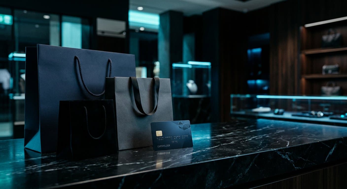
Benefits
What this changes in the business.
01
Trust before the gateway
The page already feels like a place that can take money.
02
Collections with an editor
Not a dump of tiles. Hierarchy, stories, room to breathe.
03
A cart that does not panic
Totals, shipping honesty, a quiet path back to shopping.
Process
How the work moves.
01
Audit the catalogue as a magazine
Hero SKUs, long tail, the items that photograph badly. Design follows the real shelf.
02
Set the commercial tone
Quiet luxury, kitchen-honest, festival loud — one register, not three.
03
Compose templates, not one-offs
The 400th product must still look considered.
04
Prototype the buy on a phone
If it fails in one hand, it fails.
Technology
Tools we actually ship with.
- Figma
- Shopify or Woo reference
- Image specs
- Motion notes
Questions
Straight answers.
Usually yes. Design-only is possible when the engineer is close and the platform is decided.
Places
Where this work sits.
Industries
Sectors that often need this.
Journal
Notes on the same craft.
Start a project
If the shop looks like a theme demo, design is the highest-leverage work you can buy.
Tell us what you are building. We will reply with a clear next step — usually on WhatsApp.